
Nokia revamps its iconic logo for 1st time in 60 years
By MYBRANDBOOK
Nokia has announced its plans to change its brand identity for the first time in nearly 60 years. As the telecom equipment maker focuses on aggressive growth, it has come out with a complete new logo. The new logo comprises five different shapes forming the word NOKIA. The iconic blue colour of the old logo has been dropped for a range of colours depending on the use. While Nokia still aims to grow its service provider business, its main focus is now to sell gear to other businesses.
Besides unveiling a new logo, the brand also outlined how it expects networks to evolve in the next seven years or so, and how it is planning to evolve in line with these changes.
“There was an association with smartphones and nowadays we are a business technology company,” Chief Executive Pekka Lundmark said in an interview.
Lundmark further said that Nokia will focus on adding market share in the company's business by serving wireless service providers with network equipment. The company also plans to review the growth path of its different businesses and consider alternatives, including divestment.


Legal Battle Over IT Act Intensifies Amid Musk’s India Plans
The outcome of the legal dispute between X Corp and the Indian government c...

Wipro inks 10-year deal with Phoenix Group's ReAssure UK worth
The agreement, executed through Wipro and its 100% subsidiary,...

Centre announces that DPDP Rules nearing Finalisation by April
The government seeks to refine the rules for robust data protection, ensuri...

Home Ministry cracks down on PoS agents in digital arrest scam
Digital arrest scams are a growing cybercrime where victims are coerced or ...


ICONS OF INDIA : SUNIL VACHANI
Sunil Vachani is the Chairman of Dixon Technologies (India) Ltd. Under...
Icons Of India : Deepak Sharma
Deepak Sharma spearheads Schneider Electric India. He brings with him ...
Icons Of India : NEERAJ MITTAL
He started his career as an IAS Officer in 1992. He has held various a...


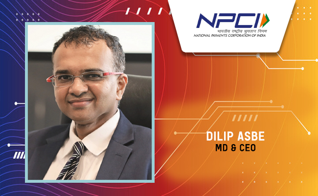
NPCI - National Payments Corporation of India
NPCI is an umbrella organization for operating retail payments and set...
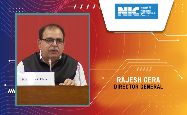
NIC - National Informatics Centre
NIC serves as the primary IT solutions provider for the government of ...
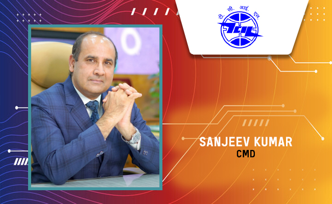
TCIL - Telecommunications Consultants India Limited
TCIL is a government-owned engineering and consultancy company...


Indian Tech Talent Excelling The Tech World - Anirudh Devgan , President, Cadence Design
Anirudh Devgan, the Global President and CEO of Cadence Design Systems...

Indian Tech Talent Excelling The Tech World - JAYASHREE ULLAL, President and CEO - Arista Network
Jayshree V. Ullal is a British-American billionaire businesswoman, ser...
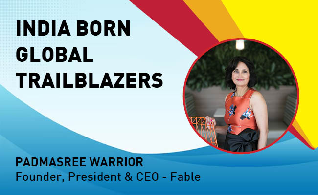
Indian Tech Talent Excelling The Tech World - PADMASREE WARRIOR, Founder, President & CEO - Fable
Padmasree Warrior, the Founder, President, and CEO of Fable, is revolu...


 of images belongs to the respective copyright holders


 goes on sale today, starting at Rs 19,999")